
Scripor Alphabet: Color Accessible to All
“Their project management demonstrated a positive approach, characterized by prompt and responsive actions to address our needs effectively.” - Tudor Scripor, Director
About the app
The Scripor Alphabet App is an innovative application designed specifically for the visually impaired to learn and master the Scripor Alphabet, a unique tactile writing system that represents colors.
The app's primary goal is to provide an accessible and engaging platform for the blind and visually impaired community to learn about colors and express themselves through this revolutionary alphabet.
Some of the key features within the app include:
Tactile Learning: Innovative haptic feedback to create a tangible experience of colors.
Color Exploration: Tools to explore color combinations, blending, and the color spectrum.
Creative Outlet: A canvas for users to create artwork using the Scripor Alphabet.
Accessibility: Designed with screen reader compatibility and adherence to accessibility standards.
Comprehensive Lessons: Interactive lessons on the Scripor Alphabet, including text-based and audio instructions.
Challenges
Traditionally, the Scripor Alphabet was disseminated through physical Braille manuals, limiting its reach and accessibility. The primary challenge was to effectively digitize this tactile system into a mobile app while preserving its core principles and benefits.
Additional obstacles included:
User Testing: Adapting the app to the unique needs and preferences of visually impaired users required extensive testing and iterative development.
Haptic Feedback: Accurately replicating the tactile experience of the Scripor Alphabet through haptic technology was a complex technical challenge.
Global Reach: Ensuring the app's accessibility and effectiveness across different languages and cultures posed localization challenges.
Solutions
We employed a user-centric approach, focusing on creating a seamless and accessible digital experience.
Prioritizing functionality over aesthetics, the app's design is clean and simple, focusing on providing essential information and avoiding distractions that could hinder usability for visually-impaired users.
Launched at the end of April 2023, Scripor Alphabet app is going to serve 280.000.000 visually-impaired people around the world, out of which 30.000.000 from Europe.
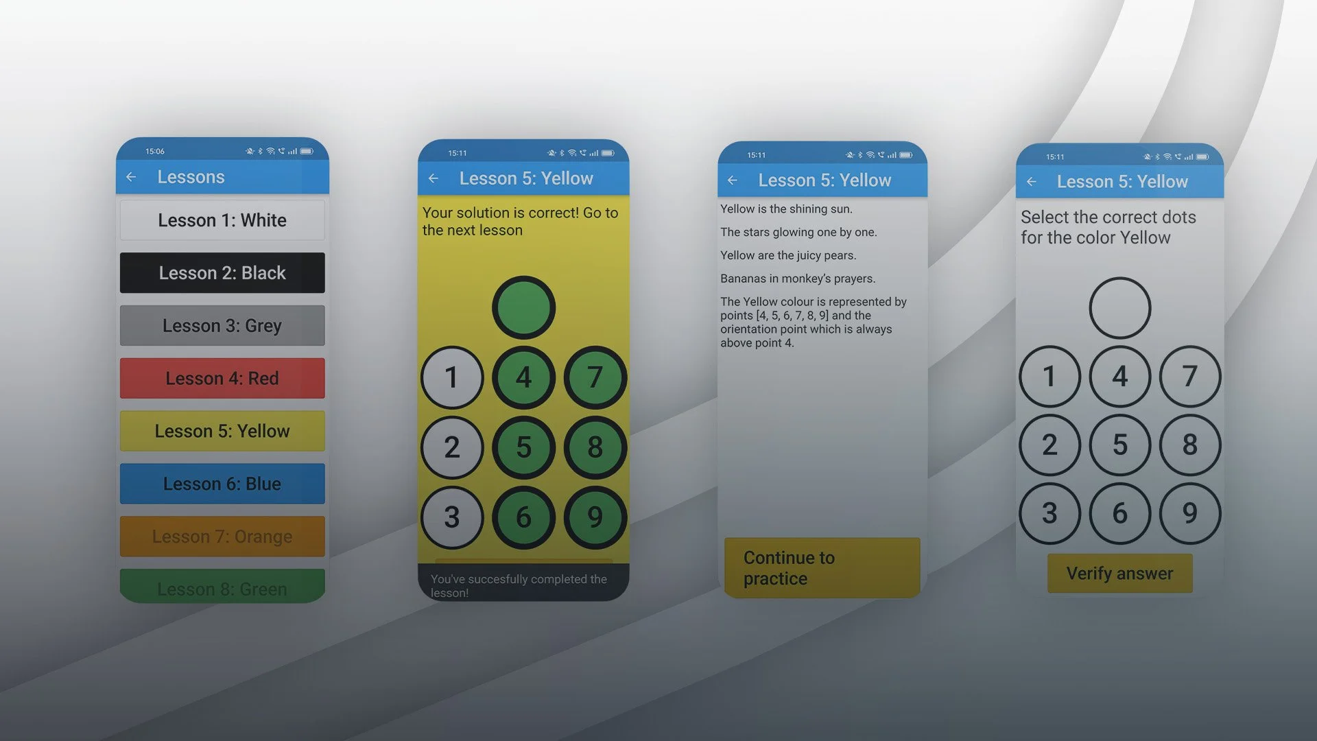
The cell of the Scripor Alphabet is composed of a total of ten dots, with an orientation dot placed above the other dot. The positions of these dots are identified by numbers from 1 to 9, with number 10 being allocated to the orientation dot.
A combination of dots in a single cell is used to represent a color, with any additional cell representing the lighter or darker shades, tones, saturation, or intensity of colors.
By leveraging Figma, Flutter and Firebase as tools, but also including feedback and screen reader compatibility, we developed effectively the app that the users needed.
